Creating a Palette - Photographs
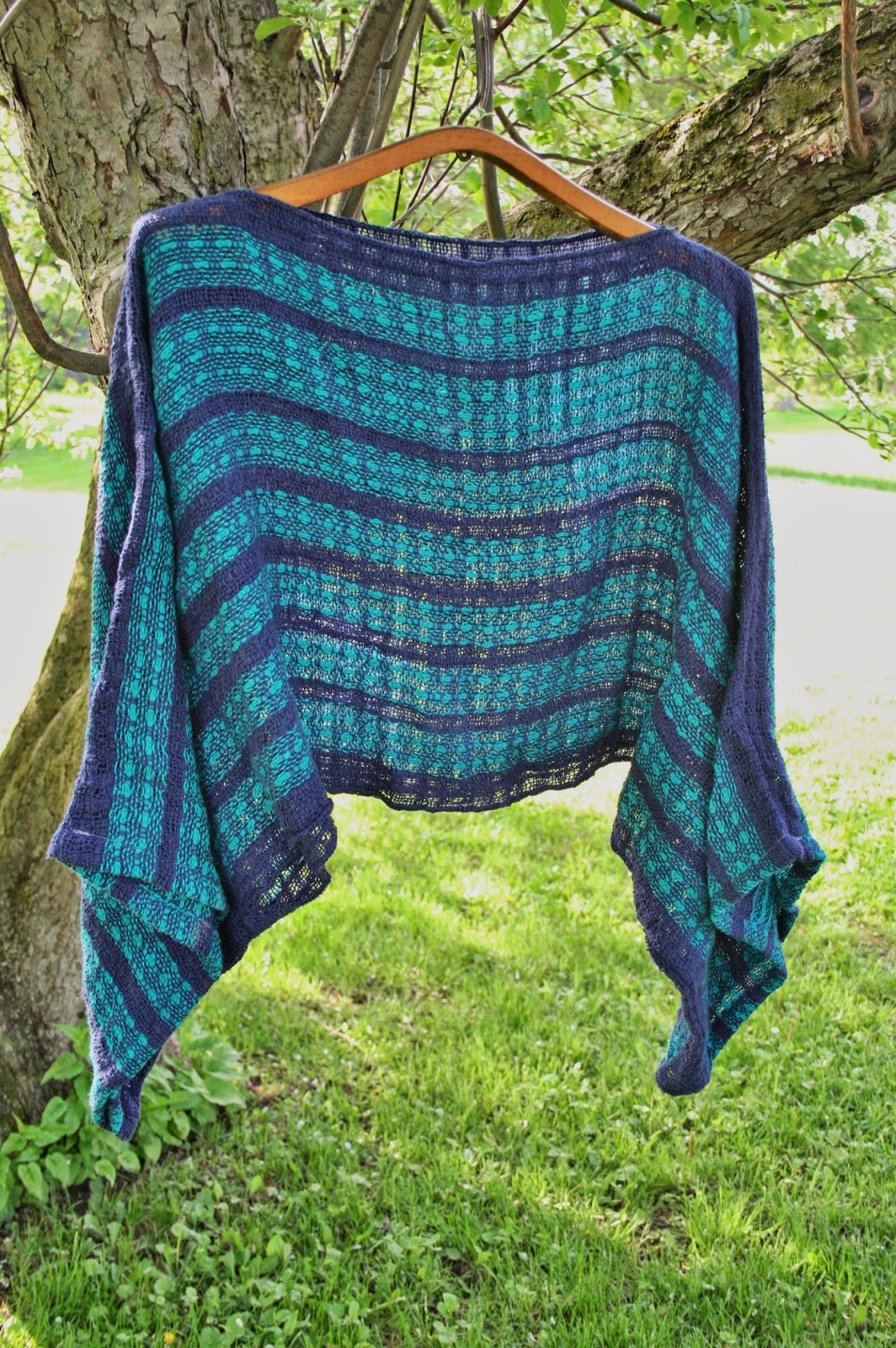
If you've been visiting the Bryony Studio site for any length of time, you have noticed the Monday Moods color palettes. Part of the reason I started them was to provide a color scheme for people to have. The other reason was to show how we can find inspiration from anywhere around us.

Case in point, the last two or three photos (Old Painted Walls, Brownstone and Speckle Stone) are all off my back porch. Other photographs come from trips around the area or abroad. When weaving, some of the hardest parts is choosing colors.
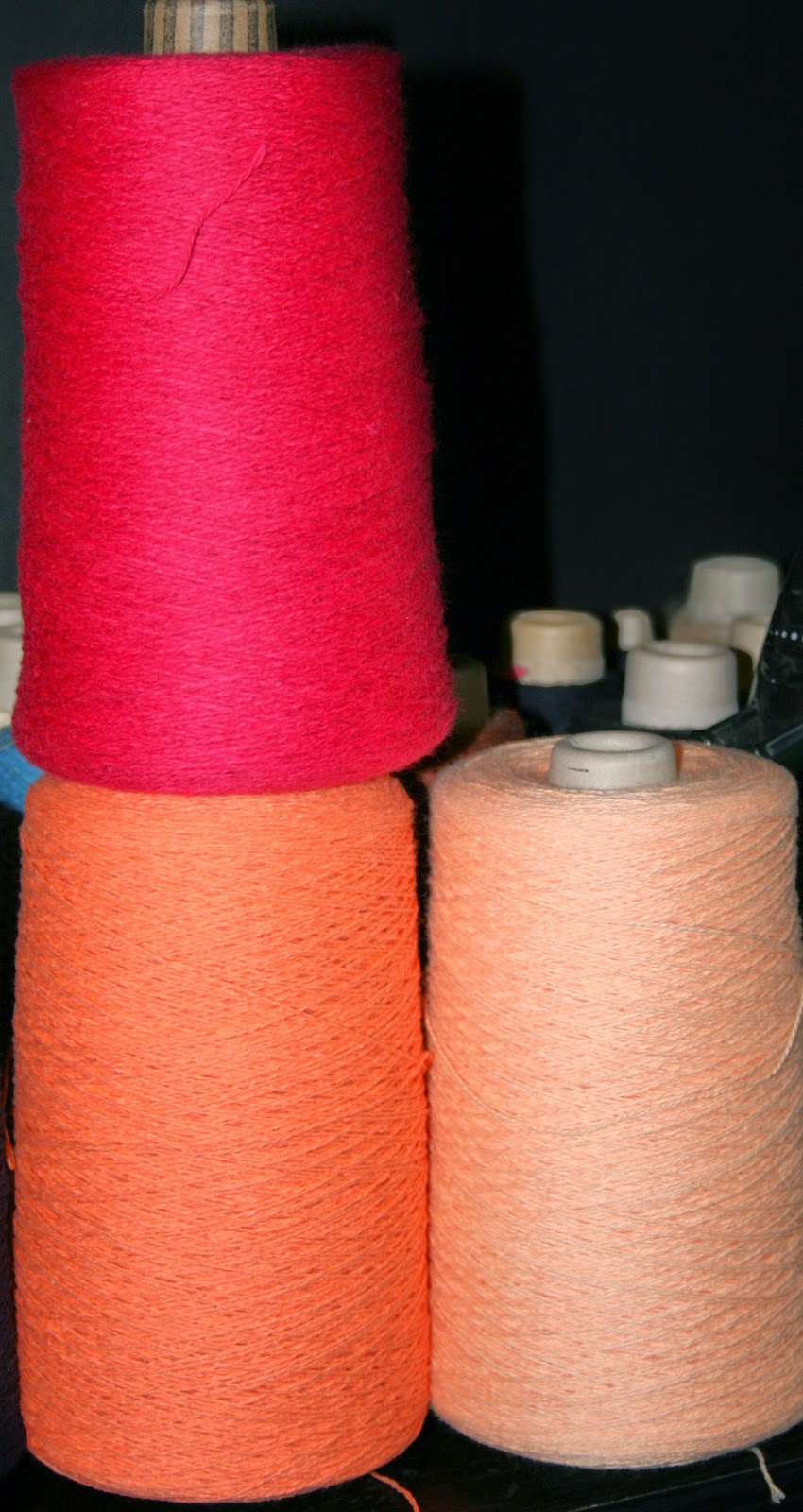
Most people have a standard color scheme they prefer for fashion, home interiors, vehicles and whatever else strikes their fancy. In my family, it falls into the blue family. Accents tend to be brown, especially wood tones, or the occasional pop of color from whatever quilt I made.
For me, I tend to work with purples and grays - two of my favorite colors in fact. What I find difficult is blending the warmer colors. Nature provides us a variety of colors in unexpected ways. Using photographs whether the ones I find around the house, or on the Internet, photographs provide a great source of inspiration.
To begin, you need an image. Sometimes, you'll have to crop the image a bit, but focus on what inspires you.

The next step, choosing the colors, can take a variety of avenues. One of my favorite sites, Design Seeds mixes the colors, Others will use the Pantone Color System which is the standard color system for designers. Pantone numbers correspond to colors so when used in printing, the colors are standard. The last choice is the dropper method. The photo below shows the dropper from Microsoft Publisher:

To use the color dropper, you focus on the color you want, and click the mouse once you have it. As you can see, I have one box highlighted. and it is that box which will take the color I choose. This method is easier, and simpler compared to the other two, but it does have its problems. For example, the color you see may not be the color you can find.

The Rocky Weed palette was one of those harder ones for me. I could see the colors I wanted, but having those colors proved to be a hard task. In the end, I ended up doing a mixture of Pantone colors as well as fudging the color through the set spectrum in Publisher. This is one of the greatest drawbacks to Publisher - the inability to mix colors.
If you want to mix your colors, I would recommend downloading one of the open source drawing programs such as Gimp. On Friday, I'll focus on yarn choices, and the next step for cloth creation with palettes.
Case in point, the last two or three photos (Old Painted Walls, Brownstone and Speckle Stone) are all off my back porch. Other photographs come from trips around the area or abroad. When weaving, some of the hardest parts is choosing colors.
Most people have a standard color scheme they prefer for fashion, home interiors, vehicles and whatever else strikes their fancy. In my family, it falls into the blue family. Accents tend to be brown, especially wood tones, or the occasional pop of color from whatever quilt I made.
For me, I tend to work with purples and grays - two of my favorite colors in fact. What I find difficult is blending the warmer colors. Nature provides us a variety of colors in unexpected ways. Using photographs whether the ones I find around the house, or on the Internet, photographs provide a great source of inspiration.
Photography and Color
To begin, you need an image. Sometimes, you'll have to crop the image a bit, but focus on what inspires you.
The next step, choosing the colors, can take a variety of avenues. One of my favorite sites, Design Seeds mixes the colors, Others will use the Pantone Color System which is the standard color system for designers. Pantone numbers correspond to colors so when used in printing, the colors are standard. The last choice is the dropper method. The photo below shows the dropper from Microsoft Publisher:
To use the color dropper, you focus on the color you want, and click the mouse once you have it. As you can see, I have one box highlighted. and it is that box which will take the color I choose. This method is easier, and simpler compared to the other two, but it does have its problems. For example, the color you see may not be the color you can find.
The Rocky Weed palette was one of those harder ones for me. I could see the colors I wanted, but having those colors proved to be a hard task. In the end, I ended up doing a mixture of Pantone colors as well as fudging the color through the set spectrum in Publisher. This is one of the greatest drawbacks to Publisher - the inability to mix colors.
If you want to mix your colors, I would recommend downloading one of the open source drawing programs such as Gimp. On Friday, I'll focus on yarn choices, and the next step for cloth creation with palettes.
Comments
Post a Comment